Portfolio Design
- Category: University Work
- Client: ---
- Project date:University year 2022/23
Project Brief
As part of our third-year submissions, I designed and published a portfolio which showcases my best project work and skills that I have acquired over the duration of my studies. This project is work for book style and E-style with good visualizations.
Assingment and Brief
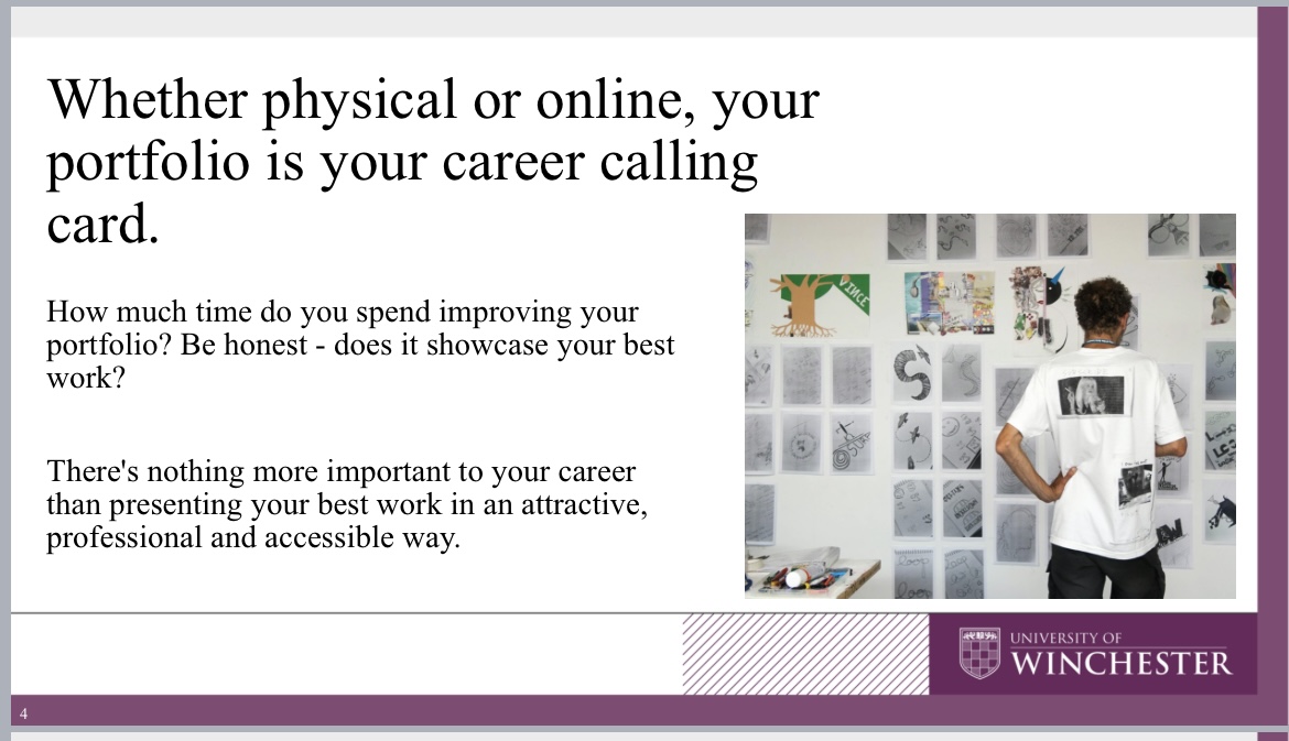
A professional portfolio remains a great way to showcase my best work, and highlight my involvement in challenging projects. It provides a great talking point during an interview, and gives more insight into your work than a curriculum vita alone could. This module will introduce students to the different types of software used for creating professional portfolios, both online and printed. It will also encourage me to be critical in the selection and explanation of the work chosen for inclusion in the portfolio. How I present my portfolio and use within an interview will be explored through workshops and scenarios, and will help in presenting my work at the End of Year Exhibition ‘Transmedia’ in May.
Inspiration
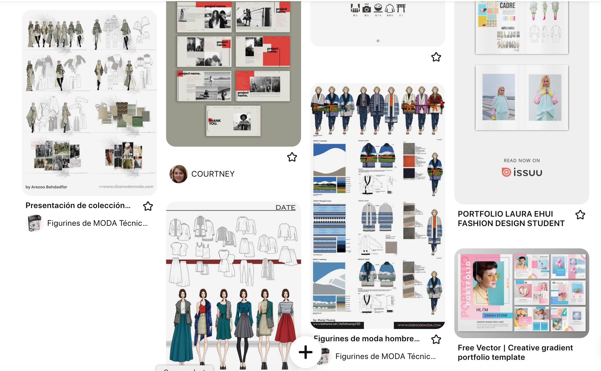
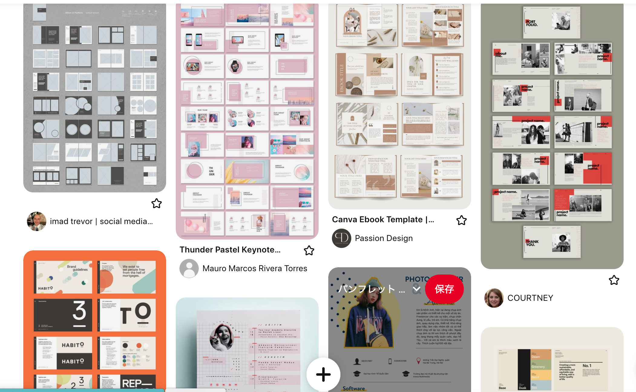
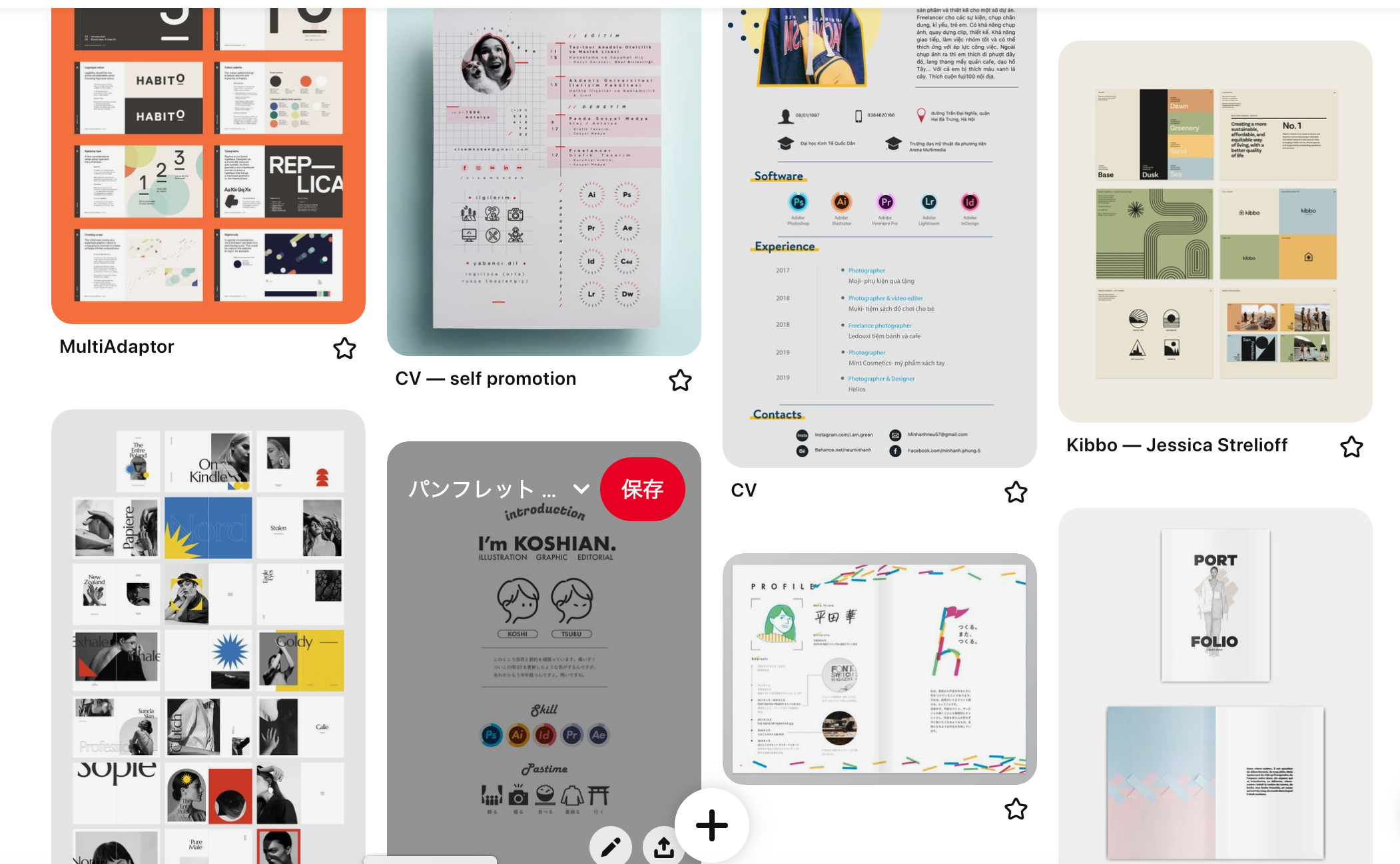
I used Pinterest images as inspiration for the frame, theme colours, book size and skill set design. I wanted the look of the pages to be in keeping with the theme of each piece or project, so I used off-white as the basic background colour and incorporated green as a point colour, as on this website.Different frames, arrangements and colours were used to make each project look good, with architectural brochures used as references for architectural projects and designer portfolios used as references for fashion design pages.
Aim and theme
Show my skills
Show my skills and my work which I have done at University. It can use for job hunting and get interest from people who related industry.
Design Theme
Design theme which is clear and creative. Also it represent my cheerful personality and passion for design.
Good Visualization
The design should be easy to read and follow the human eye, paying attention to image quality and paper overlay for book style.
Difference from website
Unlike website portfolios, which represent this journey to completion, it is important to present the completed work in a good visual way.
Submission style
Printed book
The first thing to be concentrated on is the creation of a portfolio in this style. This is because it takes time to print and needs to be ready in time for the Transmedia exhibition on 11 May. We have chosen blurb as our printing company. We chose blurb as our printing company because we can get a book with a matt cover and a near-square size of 20x25 cm in less than two weeks.
E-style portfolio
E-style portfolios should be made interactive. So I posted it on issuue so that everyone who knows the link can see and download my portfolio as if they were flicking through a book. This will help when it is shared with people in the future. The link and the PDF file will be evaluated and graded on this website.
Time Management
Printing as Book
Submission
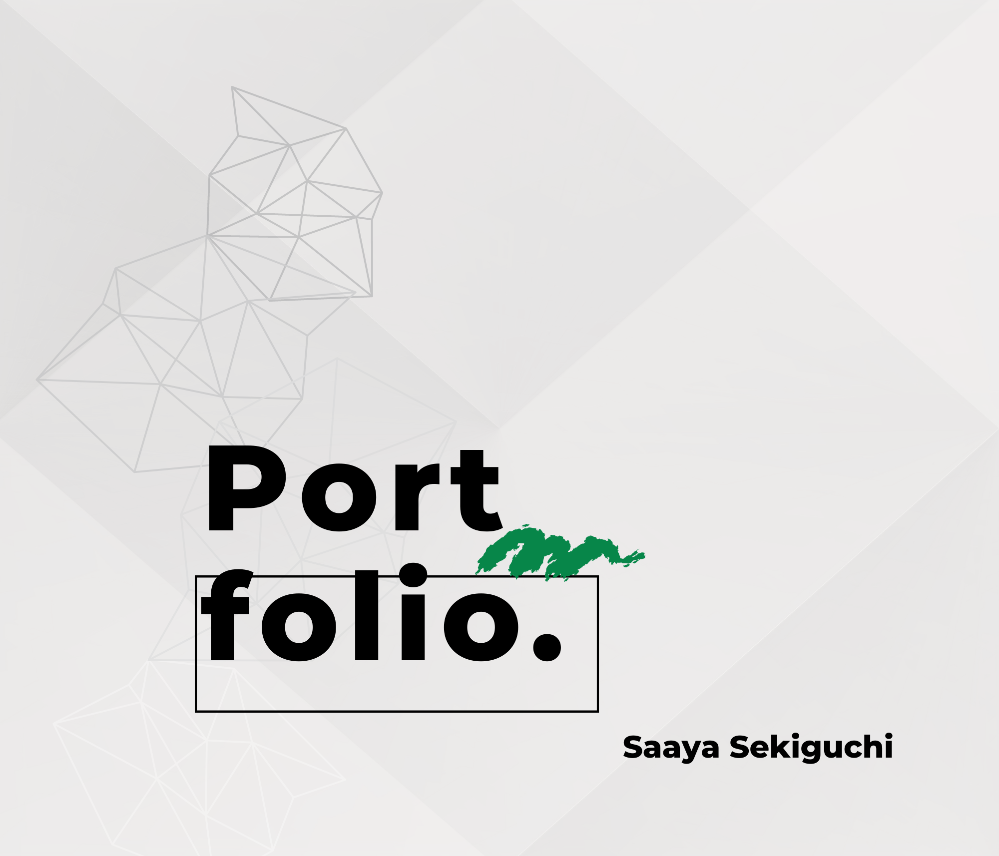
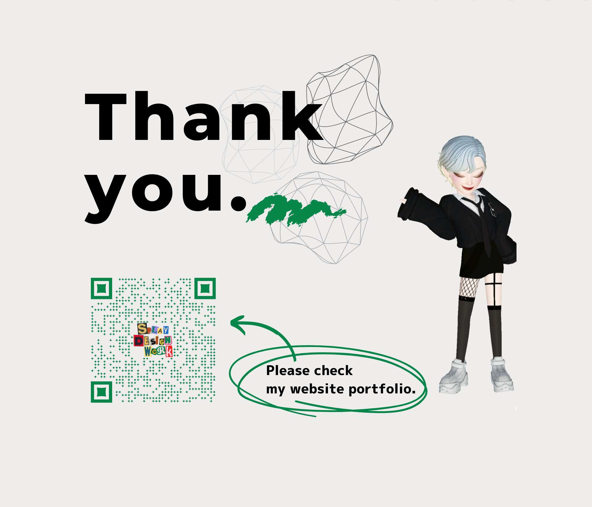
The portfolio design has the same feel as this website with a simple off-white background colour and the primary colour green. The 3D shapes of the line drawings and the hand-drawn fonts and icons scattered across the background express my strengths, which range from 3D design to 2D sketching.
sYou can view the booklet-style portfolio on the isuue website below.
