3D typograpy
- Category: Self Work
- Client: ---
- Project date:---
Project Brief
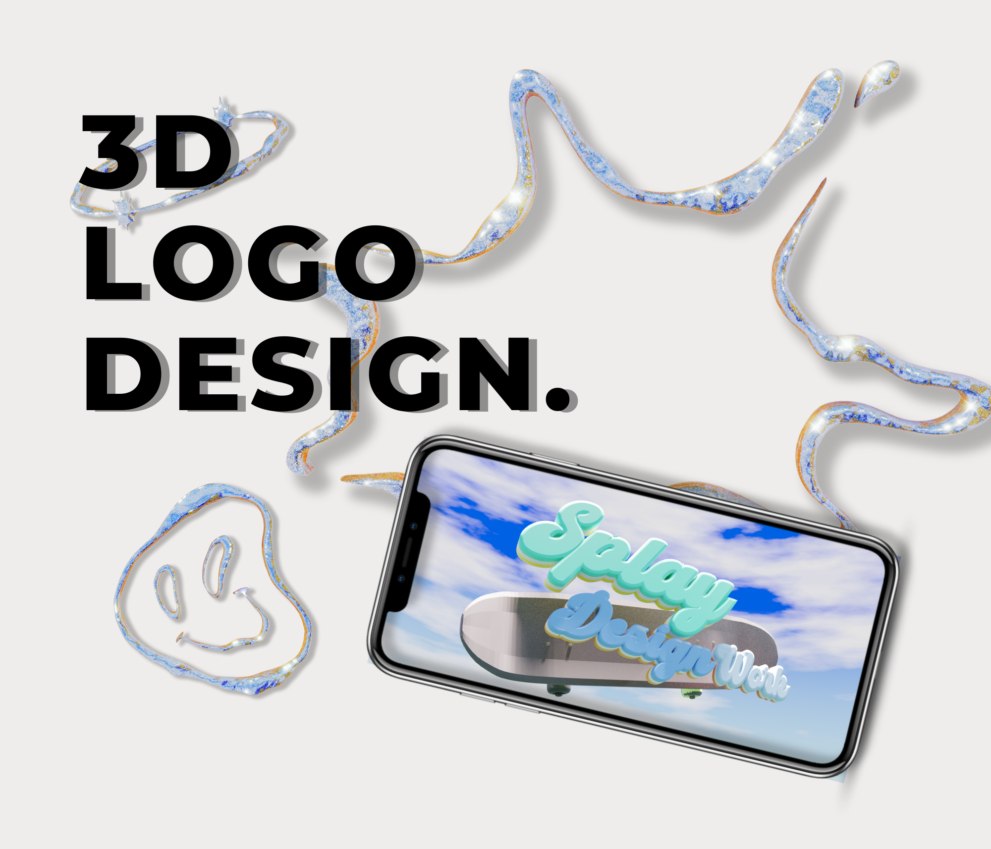
This is a 3D typography project undertaken to enhance 3D modelling skills as part of a self-study.
Inspiration
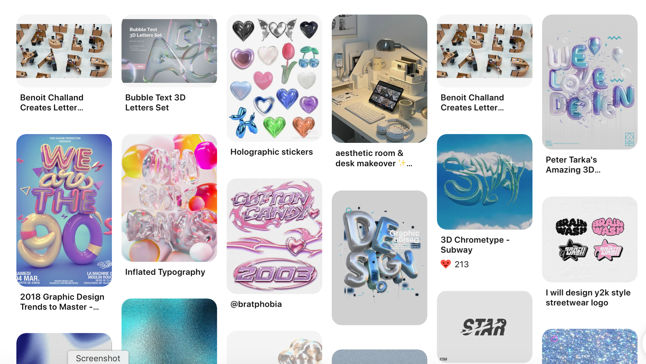
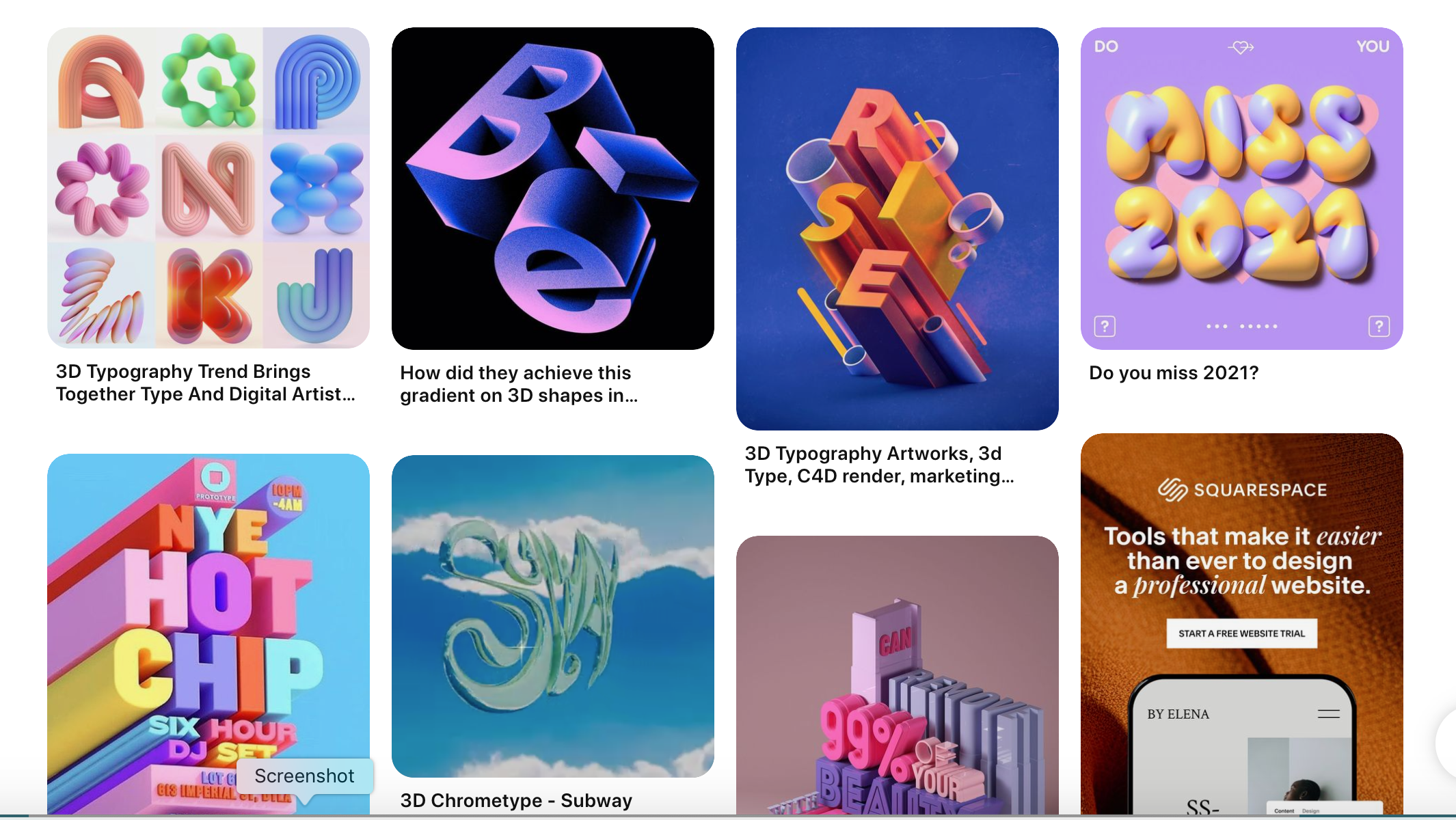
Through Instagram and Pinterest, I learned that typography is done using 3D software. I love browsing through fonts, so I started thinking that I could create free designs in a short amount of time using my favourite fans I found. This is used in the entertainment and industry for a wide range of branding and marketing, including packaging and music videos, and I think it could be used for business in the future.
Objectives
Branding / Marketing
This is a good study for me as 3D typography, which is also used for branding and marketing, is set to work in the entertainment industr
Shading skills
Typography is designed once the font design has been decided, leaving it up to the textures to decide how 3D-like they should be. It helps to develop shading skills, which is not your strong point.
Trend
Learn and develop trendy 3D skills by creating designs based on themes and designs that are popular in the world.
How to Design
Designs
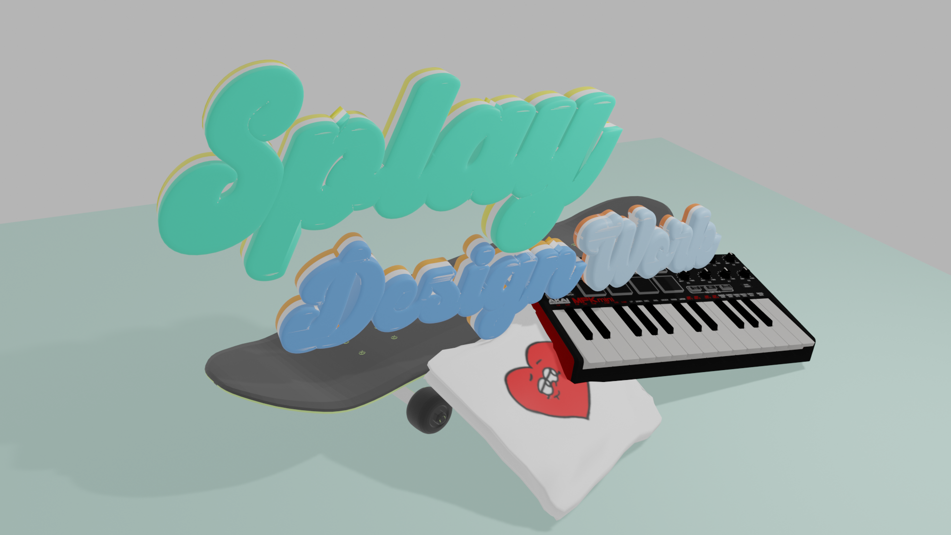
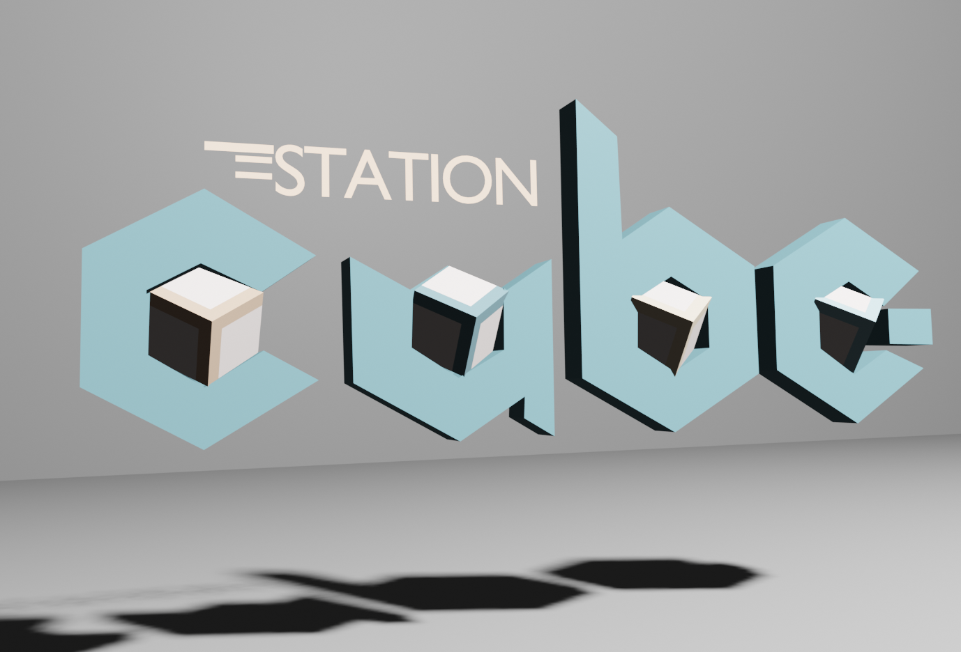
The level of design using shading has improved compared to previous years. I think Lightning can still grow, but now we can do authentic designs.
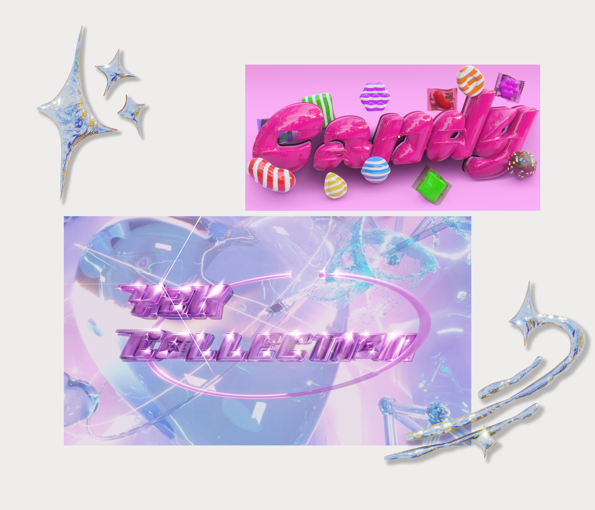
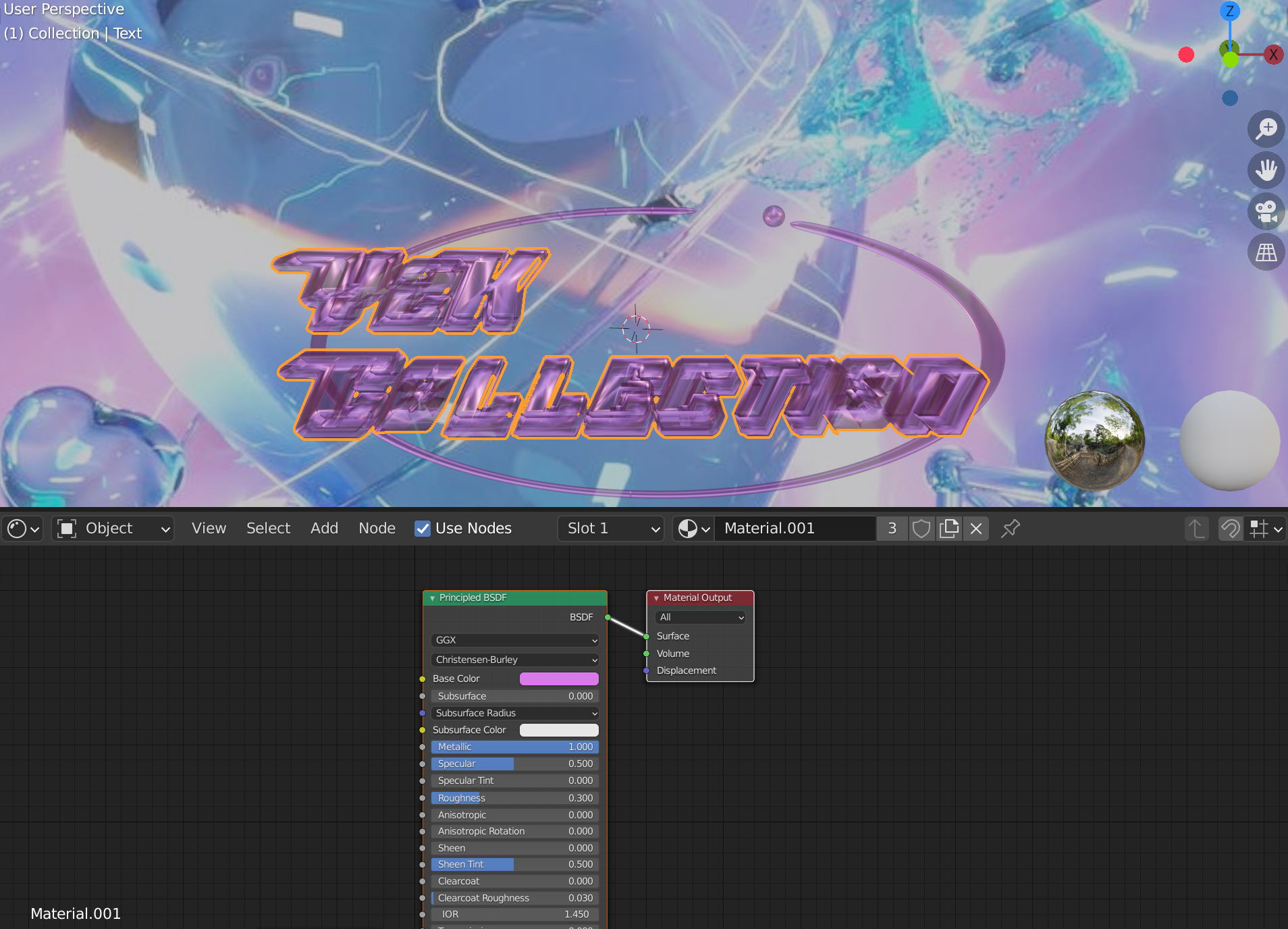
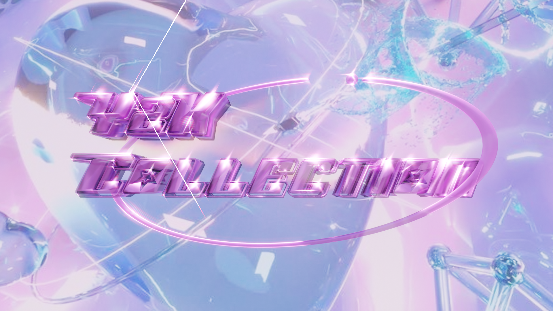
We tried the trendy Y2k design. We used a glossy logo, a background that looks like things are popping, and bright colours to create a music video logo look.
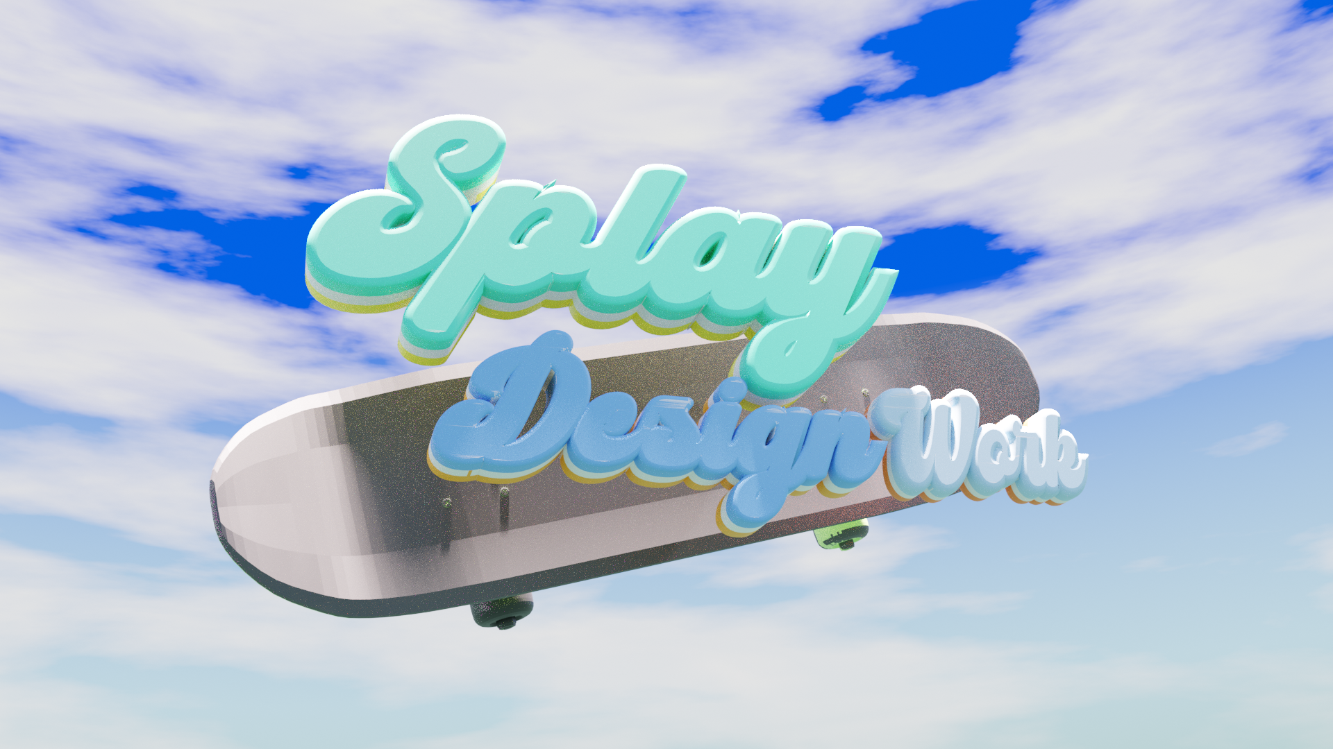
The background is a reworked version of his own 3D logo design, using an add-on that creates a sky.
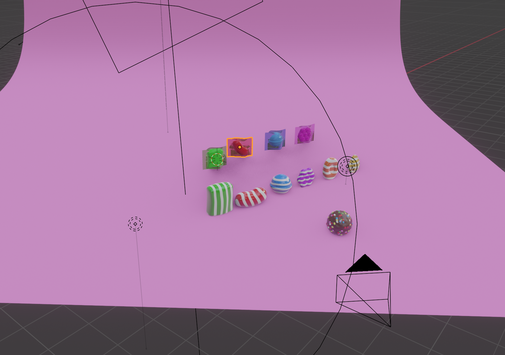
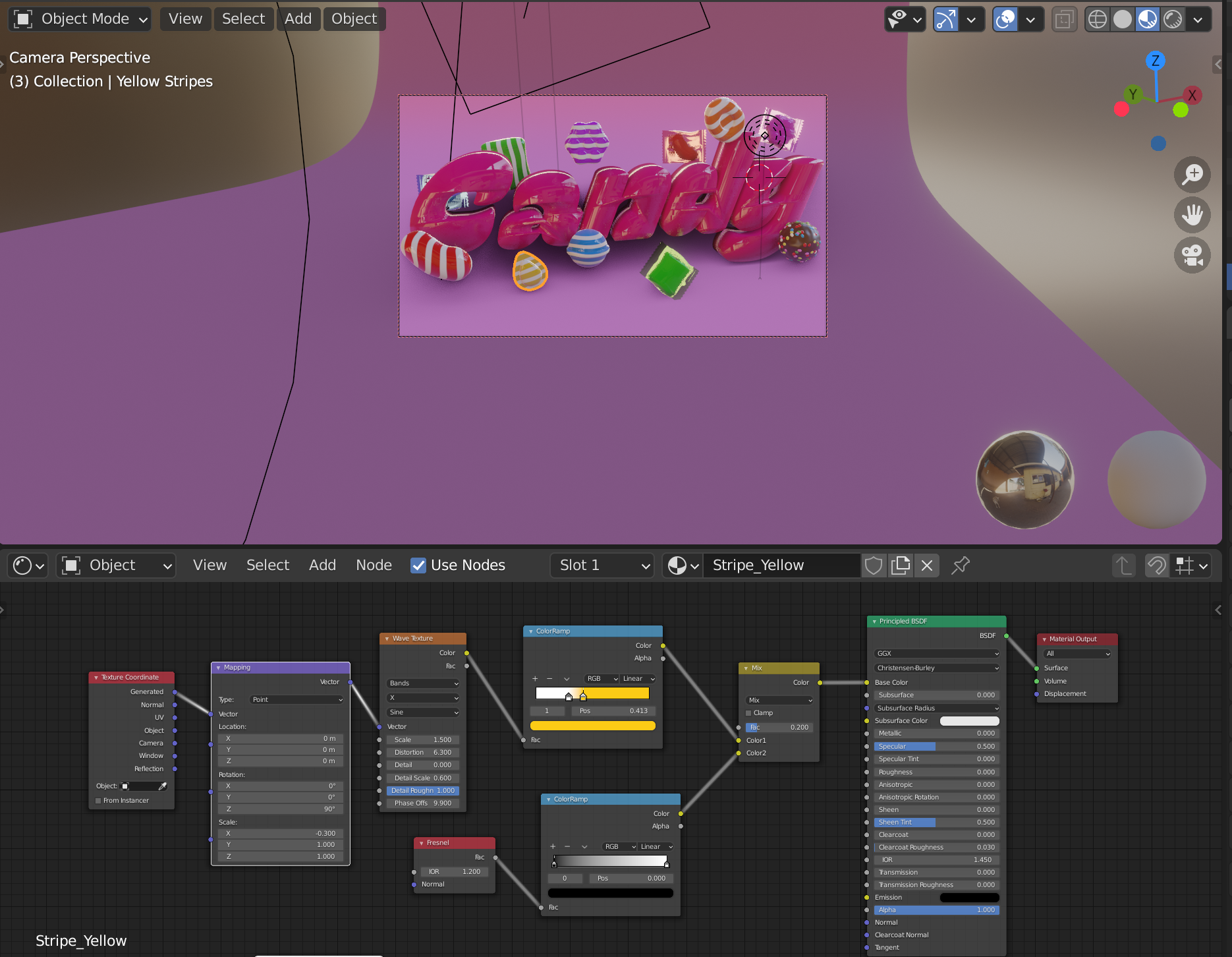
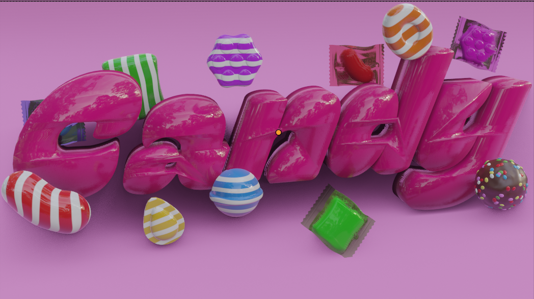
I created a candy-like shiny smooth texture and pop impression based on the image of Candy Crush and the popular K-pop song Candy.
